
Stephanie Jensen
 Data
DataHow Team USA uses data to build a digital HQ
 February 8, 2022
Team USA is using Tableau to see and understand their data. Learn how Team USA has built a world-class organization where good decisions begin with data.
February 8, 2022
Team USA is using Tableau to see and understand their data. Learn how Team USA has built a world-class organization where good decisions begin with data.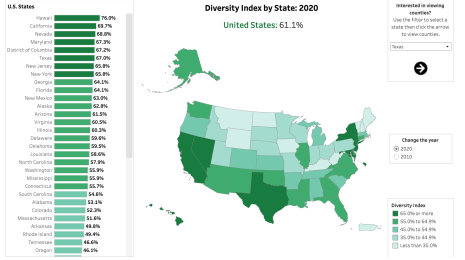 Social Impact
U.S. Census data reveals growing racial and ethnic diversity
January 13, 2022
U.S. Census Bureau 2020 data shows a more multi-racial, diverse America. As depicted in several Tableau dashboards, users can see demographic shifts from 2010 to 2020. Social Impact
Wildfire risk is an equity issue
December 9, 2021
Tableau data visualizations from Headwaters Economics show how vulnerable populations suffer disproportionate exposure to catastrophic loss from wildfire. Data Culture
Data-powered excellence: US Paralympian Lizzi Smith breaks barriers—and records
August 24, 2021
Team USA Paralympic swimmer Lizzi Smith uses data to guide her training strategy, improve her results, and learn how to become a stronger athlete and competitor.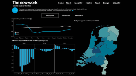 COVID-19
What we can learn from open data: COVID-19 in the Netherlands
April 29, 2021
Learn how Deloitte Netherlands is using open data in a series of dashboards to see and understand trends and broader societal impacts related to COVID-19. Social Impact
Data highlights disparities driving rent debt crisis
April 21, 2021
Explore the PolicyLink rent debt dashboard to learn how COVID-19 is disproportionately impacting people of color and deepening economic inequities.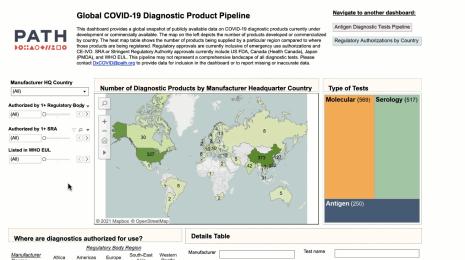 COVID-19
Data innovations in public health: PATH creates COVID-19 diagnostic test dashboard
April 2, 2021
PATH, a global health non-profit, has developed a Tableau dashboard to provide vital information about COVID-19 diagnostic tests. COVID-19
Business resilience starts with data-driven scenario planning
November 2, 2020
The pandemic has made it clear that the future is not linear, and that “one-and-done” decision making, based on a singular perspective, is inadequate given the scope of the crisis. For more comprehensive insight, organizations in both the public and private sectors are turning to scenario planning.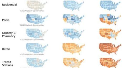 COVID-19
Mobility metrics provide unique insights into COVID-19
August 19, 2020
Human mobility is the leading factor in the spread of infectious disease, and understanding how, where, and why people move is fundamental to understanding diseases like COVID-19.
Subscribe to our blog
Get the latest Tableau updates in your inbox.