Become a Metrics Jedi: 10 tips and tricks for creating Metrics


With Tableau 2020.2, we introduced Metrics to help you track your most important KPIs in a consistent format in one place. If you missed it, check out our previous post for an introduction to Metrics. Today, we'll share some tips and tricks for creating metrics from existing and new dashboards.
Tip 1: Customize your metric before creating
Metrics are defined by what they quantifiably measure over an optional time dimension. Any filters and interactions on your viz are included in the metric definition, so be sure to apply them to define your metric exactly as you need it.
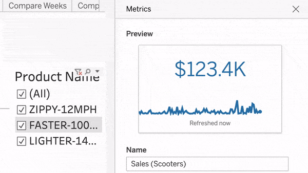
Tip 2: Title your metrics consistently and always add a description
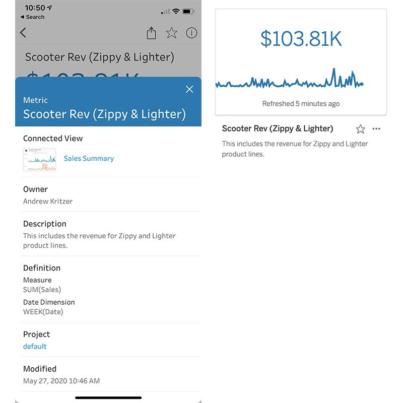
Titles and descriptions make metrics easier to interpret and more trusted, especially when sharing them with others. A description provides helpful context to your end users on the web and mobile devices, and can be used to explain additional information about the metric or data source—such as the filters you applied in the first tip, above.
Tip 3: Place similar metrics in the same project or favorites
A project is a go-to page to see the high-level summary of your KPIs. It’s kind of like a dashboard for metrics on a specific topic. You can use the Favorites feature like your personal dashboard. Plus, if you’re using favorites, you can sort and organize them by clicking and dragging them in a web browser!

Tip 4: Include all time to make the most out of Adjust and Compare
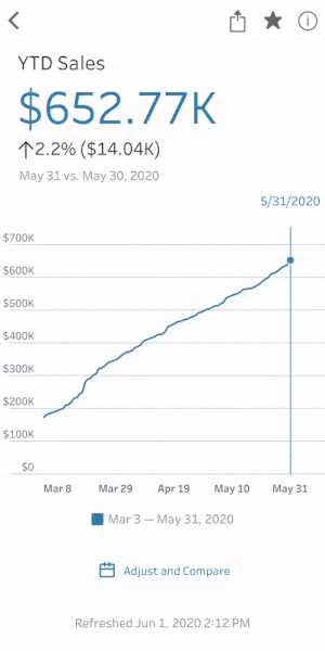
Include all time to enable metric viewers to explore more data and make more comparisons. Others might want to reference past data points and filtering at the source can limit this potential. Anyone viewing metrics on Tableau Mobile can adjust or shorten the time window, using the ‘Adjust and Compare’ option in the metric details view.

Creating metrics from a new dashboard
As a Tableau Creator, you might be wondering, how do I author a metric to make it as user-friendly as possible? Here are a few tips for when you are the author of the connected dashboard.
Tip 5: Build a “metrics creation” dashboard or sheet
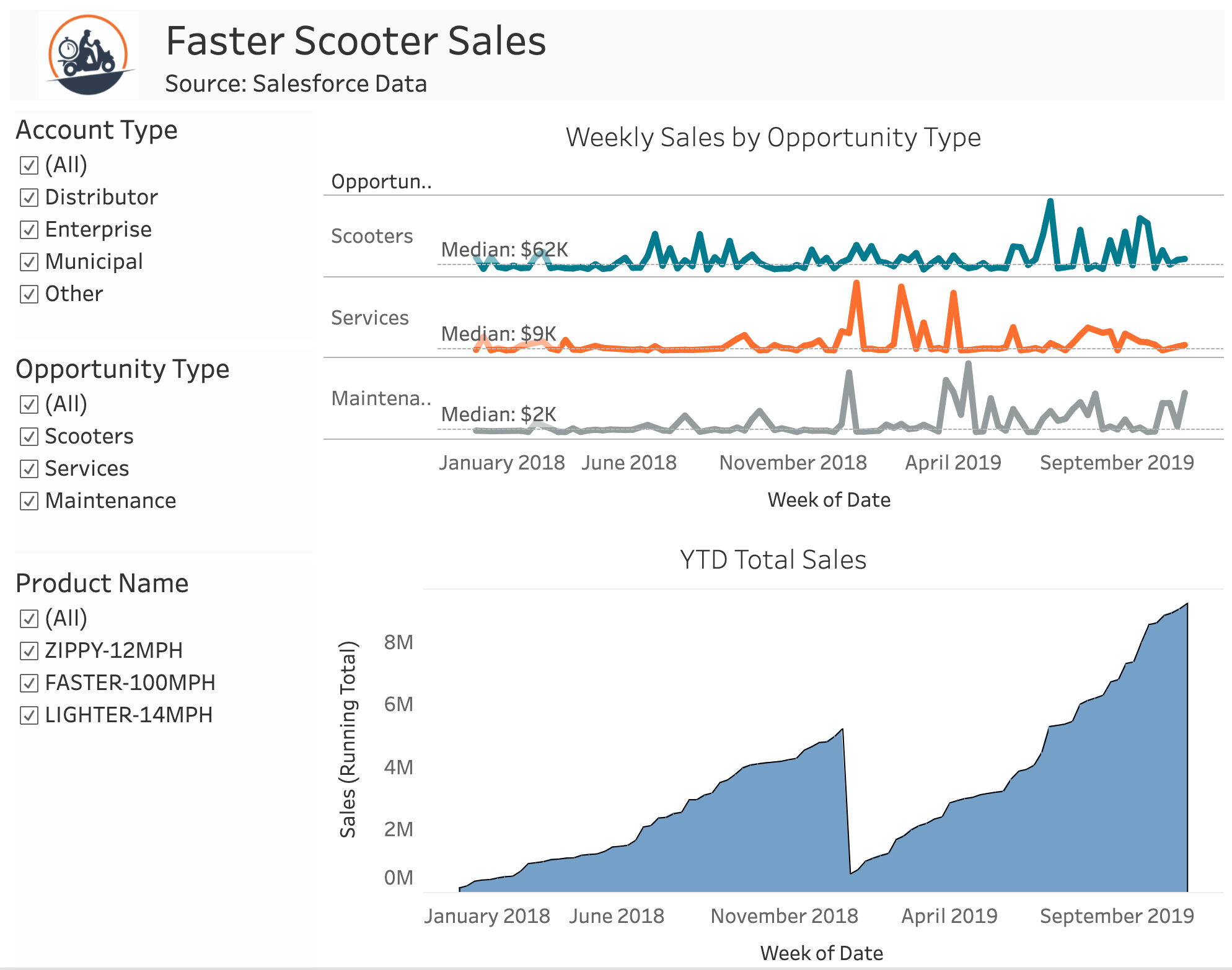
Try a sheet with a simple time series and with multiple dimension filters. This example uses Salesforce data and allows the metric creator to quickly filter sales by product, opportunity type, and account type. If you want even more flexibility, try a dashboard with a Measure Names filter and Measure Values time series, or enable toggling between measures with a parameter.
Tip 6: Use a date/time to get an automatic time series
Always use either date parts or date truncs, but not both! Tableau will automatically group together date parts into a full date (e.g. 2019 with January) but it won’t mix together date parts and date values (e.g 2019 with 12/31/2019).

If your view contains date parts that are not a full date (e.g. a month without the year), your viz must be modified to include a full date. For more information on when metrics can’t be created, see our support documentation.
Tip 7: Make sure the data extracts are refreshing or connection is live
If you’re using live connections, there’s nothing to worry about—Metrics will update every hour on Tableau Online, and Tableau Server admins can configure updates to occur even more frequently.
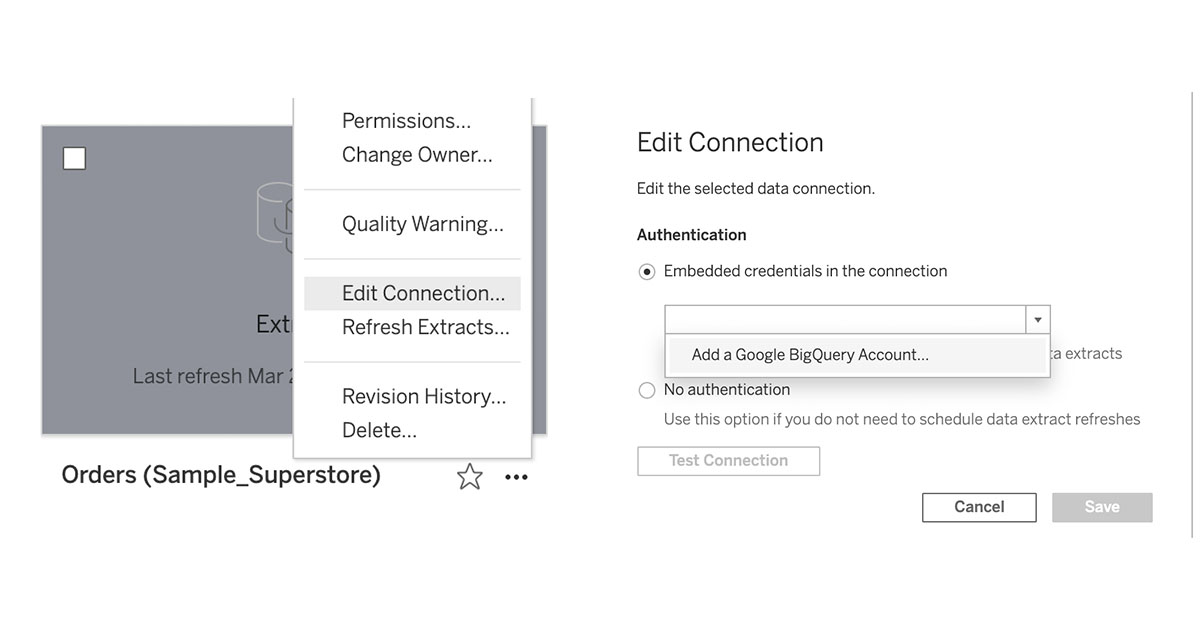
If you’re using an extract, make sure it’s updating. When you have a Published Data Source, click the action menu (...) then Refresh Extracts...

Select a refresh frequency. Your metric will automatically update after the refresh happens!
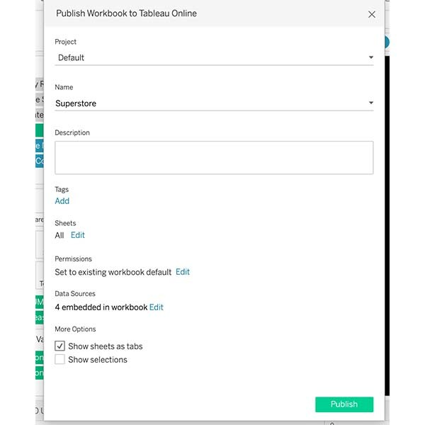
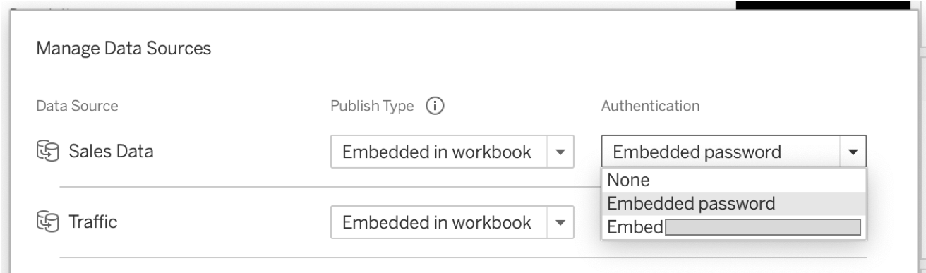
Tip 8: Embed your data source passwords
A metric needs embedded data sources to update automatically. Here is how to embed your data source passwords to allow this:
When publishing from desktop, click Edit next to Data Sources. Select Embedded Password to include the password with the data source.
When you have a published data source, click the action menu (...) then Edit Connection... Then select your credentials or add an account.
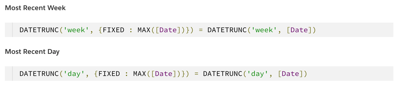
Tip 9: Consider showing only complete periods
Imagine you’re tracking a daily sales metric and you want to compare it to the sales from the prior week. It’s Monday morning at 10 AM, and compared to last Monday sales are looking pretty low—but you know it’s because today only has partial data! Monday isn’t over. In these situations, you may want to avoid comparisons that involve partial periods.
You can do that by filtering your dashboard or view with a calculation (set to False):
Tip 10 (advanced): Try running total metrics or other table calcs for tracking goals
Now imagine you want to track year to date sales compared to the same day last year. You can do this by creating a metric to compare a running total measure.
- Add a date dimension to Columns, either with a calculation (DATETRUNC('day', [Order Date])) or selecting the Day date trunc option in Tip 6, which appears as a green pill in a Tableau.
- Add a measure to Rows, right click → Quick Table Calculation → Running Total
- Add a dimension for the date to the level of detail (MAX(STR(DATETRUNC('year', [Order Date])))). Right click and uncheck Ignore in Table Calculations.
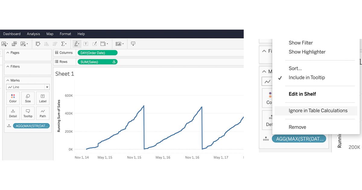
Now you can publish your view and create a metric that tracks YTD sales compared to a prior year!
Start tracking your data with Metrics today!
Metrics is available now for sites on Tableau Online and Tableau Server 2020.2. To get started, open a dashboard or view and click Metrics in the toolbar. Upgrade to Tableau 2020.2 and be sure you’ve updated Tableau Mobile (the app is available for iOS and Android) for the best experience tracking your metrics.
If you missed our previous post, read it for an introduction to Metrics.
Related Stories
Who is Einstein Copilot for Tableau for?
 April 10, 2024
Securely Access and Analyze All of Your Data with Data Connect for Tableau Cloud

How Can I Trust Einstein Copilot for Tableau?
 April 2, 2024
Subscribe to our blog
Get the latest Tableau updates in your inbox.